
- cross-posted to:
- [email protected]
- cross-posted to:
- [email protected]
You must log in or register to comment.
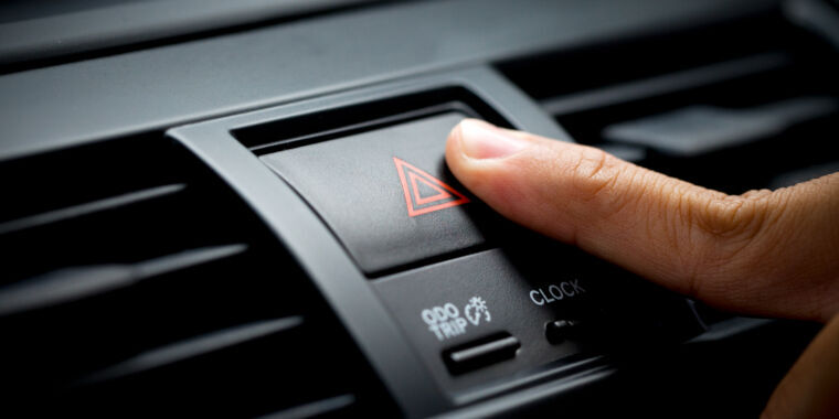
This is a win for consumers, touch screens are bloody awful when driving and take away far too much of your concentration
IMO the capacititive buttons with no feedback are even worse than the touch screen. at least with the touch screen, you will likely have a colored UI element on screen to press. with the cars that replace all the buttons with capacitive buttons with no feedback, theyre all the same color.
no feedback? 🤔
either the button or an indicator lights up or you see/hear what the button is supposed to activate or stop
*haptic feedback. The touch and press should be two different actions, not the same action. Otherwise, you need to look at a button to know where it is and if it did what it was supposed to do, which distracts you from driving.
Touchscreens are not that much better in this regard, IMO
I’d be fine with one that works like the Taptic engine on iPhones or how ever the trackpad on my Macbook does. It’s a solid surface with no moving parts but it clicks when you press it and it feels 100% the same as pressing a physical button. It’s way different than haptic feedback done with just the vibrator motor.
That doesn’t work well in a car though. It works in a phone because you’re holding it, or a trackpad because you’re putting a lot of pressure on it. In a car it’s already shaking from the engine, road, etc. Plus those taps are generally much shorter and lighter and less likely to feel the vibration.
Just have it swerve when you press a button!
I do agree with you, though why not just not buy cars which have touch screen controls? You don’t need legislation to filter your purchases.
You do though. Without legislations, cars wouldn’t have safety features by default like crumple zones, airbags etc. Without legislations, companies could do whatever they want to pad their bottom line. You need laws to define what is and isn’t acceptable, especially when it comes to safety.
No one ever requested screens instead of buttons. It’s probably some BS some CEO came up with and forced the engineers to implement.
Touch screen, Vibration feedback/Color change or not, means that you have to look at what your hand is doing and not on the road.
A physical button means you can keep your eyes on the road and find the right button with easy.
So let’s be honest. At this point, touch screens are chosen by car makers because cost and not design. So essentially, safety is less important than cost for the car makers.
The main reason why I didn’t want high end packages for our last car was, that I am a cheap bastard. The second reason is, that I think touchscreens in cars are one of the dumbest ideas imaginable.
There are places where touch controls make a lot of sense. Cars is not one of them.
My stove also has touch controls and I’d like a stern word with whomever designed it because it’s the biggest fucking bullshit. I’ve burned myself on those controls, I’ve had the stove turn itself off and refuse to turn on again because of water splashing onto the controls, I’ve had it turn on and glitch out because I’ve cleaned it off with a slightly damp rag.
When I’m driving I absolutely don’t want to dig through non-tactile menus just so I can adjust the climate or turn on my heated seat. Plus, the lack of tactility sucks for blind people. Sure blind people won’t drive, but imagine having to ask the driver to change your AC for you? In the dark of winter with ice on the roads that’s just horribly irresponsible of whomever designed it.
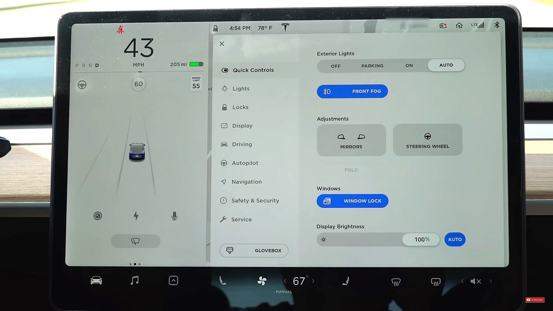
Tesla’s Model 3 uses a touchscreen for damn near everything. Some things are buried and require multiple presses in different places on the screen. It looks really good, but the actual purpose and the fact that humans driving at potentially deadly speeds need to operate it seems to have been placed a distant second to safety when the thing was designed. Given who is in charge of Tesla it’s not much of a surprise.
it *used to look good, but then they fired the former-apple designer and hired some hack who worked on android, and it looks god awful
before: https://www.teslarati.com/wp-content/uploads/2019/04/model-3-ui-1.jpg
after: https://miro.medium.com/v2/resize:fit:1400/format:webp/1*zNdNui2-s30EEAqCDy8vRA.jpeg
the 2010s was a mistake


