
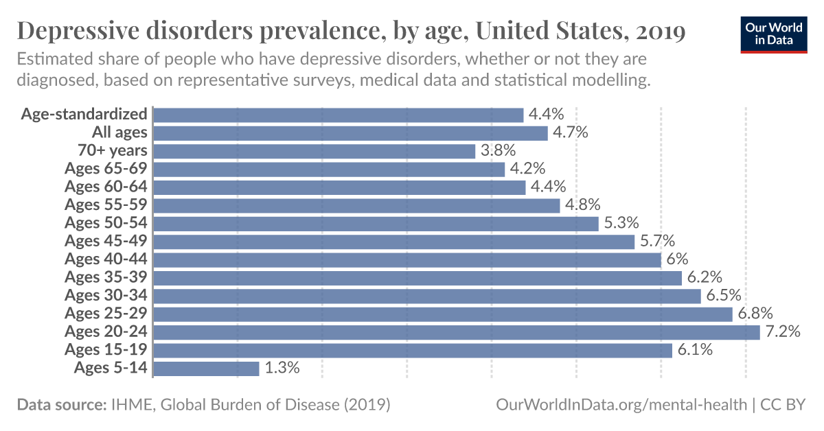
Different countries have different distributions, click “change”. Canada, Australia, New Zealand have similar to the US. France, Germany, UK peak 40-44.
Different countries have different distributions, click “change”. Canada, Australia, New Zealand have similar to the US. France, Germany, UK peak 40-44.
I gotta say, that’s a great interactive graph. Not only does it allow you to change regions, you can easily change from a single year to multi-year timespan graph to see how it changes over time.
I just wish the timespan graph would display the values still ordered by age. Because I was wondering if would shift with the/a generation getting older or not.